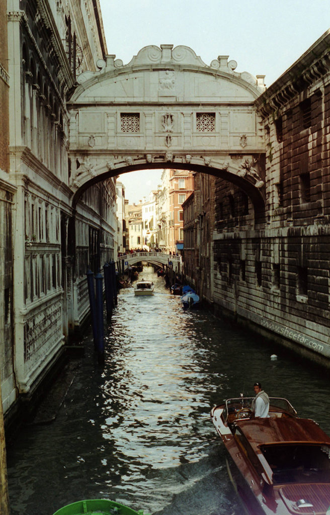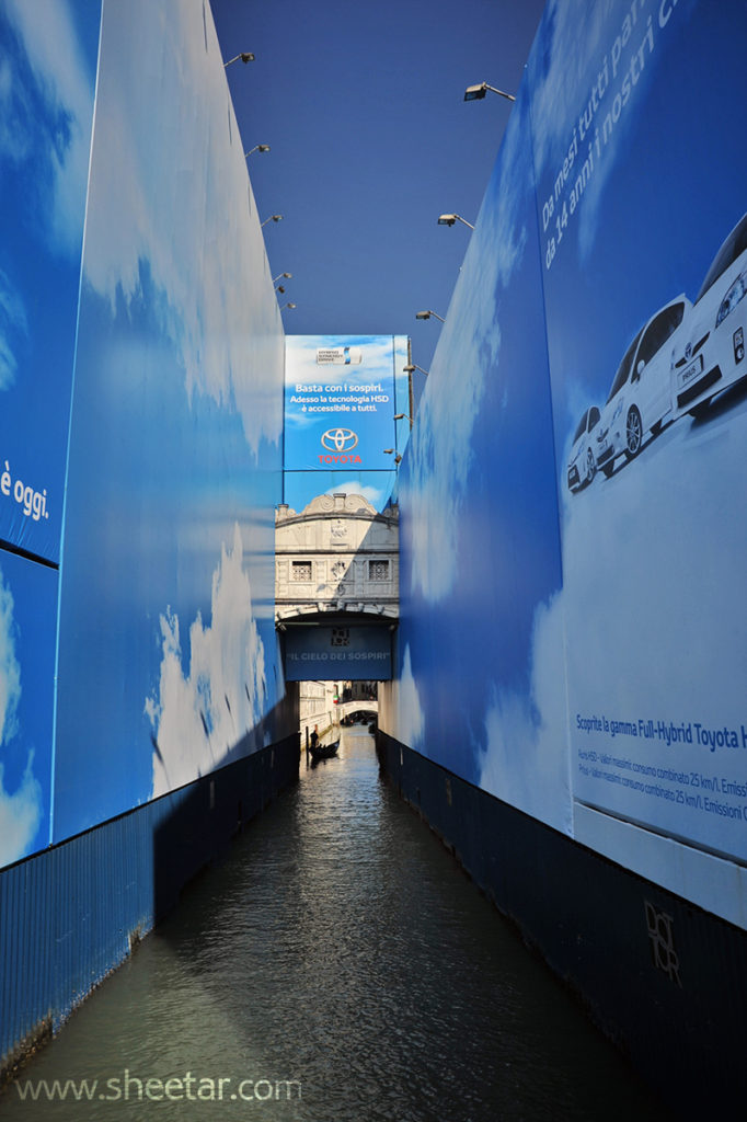

Another Sepia Saturday! This one is a little less Sepia than usual, but I had two photos taken of the same location in the prompt image at different times and really wanted to use them. On the left is a photo I took while studying abroad in college in April of 2002, scanned from film. On the right is an image from a vacation we took in March of 2011. What a difference! The bridge was undergoing restoration apparently sponsored by Toyota during our later visit and I was more than a little disappointed that the advertisement covered the whole alleyway around the bridge. On the sign just above, it reads, “Basta con i sospiri. Adesso la tecnologia HSD è accessibile a tutti,” or “Enough with the sighs. Now HSD technology is available to everyone.” Below it reads, “Il cielo dei sospiri,” or, “the sky of sighs.” During the restoration, the project was referred to as the latter, Sky of Sighs, since the advertising around it was a blue sky with clouds. I understand the need for cleaning and restoration of such an old piece of architecture, but needless to say, I was a little disappointed to have the view obstructed to that degree. I probably would’ve much rather seen scaffolding than that mess! At least I got a chance to see it without all the ads the first time around. Rather short and sweet and no big genealogical insights this time, but since I had photos just like the prompt image, I couldn’t help but use them!


What a difference between your two photographs! At least you could still see the actual bridge in 2011, or was that just a lifesize photograph of it? They sometimes create billboard photographs of the real thing while renovations are underway, which is disappointing for tourists but better than nothing I suppose. Hopefully the bridge is now back to its full glory, five years later, although sometimes those renovations can take years, like the original construction probably did!
It was the actual bridge, or what bits they didn’t cover with advertising.
I thought for a moment you’d done a bit of computer ‘magic’ with the shot on the right until I read your text. I can imagine it was quite a disappointment to see it thus. I wonder what the folks in the buildings on either side thought about that?
I don’t think I’d want to be living in any of the buildings behind the advertising! Let’s hope they made plans to be elsewhere while the renovations were going on and not looking out their windows at the ugly back part of the advertising.
If you only had those two photos of the bridge — those were the ones!! What a contrast!